Maximalism
First up, maximalism. Rooted in 17th century Baroque and Rococo, maximalism is the philosophy that more is, well, more. It was a celebration of opulence and featured dramatic, ornate layouts. This celebration morphed into a counterculture statement during the rise of sleek modernism in the late 20-century through pop-art and postmodernism styles.
Today, you can see it as more of a “curated chaos” with a single hero element embedded in mixed media, vibrating color combos, and dual aesthetics. Designs are created through experimentation and are more about invoking an emotional response from the viewer than piling elements onto a page.
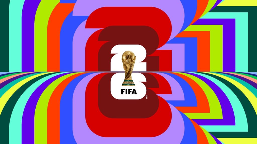
You can see it prevalently in the 2026 FIFA World Cup branding with their bold typography, vibrant color palette, and layered effects.
Neobrutalism
Next up, neobrutalism. Originally an architecture aesthetic, brutalism shunned decoration in favor of raw materials. In the design world, that translates to functionality. It’s often been described as anti-design because layouts are stripped to their bare bones—only including what’s absolutely necessary. A good example of this aesthetic is Craigslist, who’s held a simple, text-only landing page since its launch.
Devoid of any embellishments, brutalism can feel cold & harsh. Enter: Neo-brutalism. Neobrutalism solves these critiques by combining functionality with a humanistic twist. In 2026, neobrutalism warms the harshness with bold typography, vibrant colors, and textures.
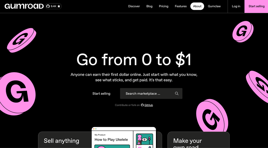
You can see neobrutalism in action on Gumroad’s website. They use high contrast colors, bold type and stark outlines to avoid oversimplification while still prioritizing usability.

Craftsmanship
Finally, an aesthetic I’m calling craftsmanship. Born directly as a reaction to AI slop, craftsmanship features tangible, handcrafted elements. This includes incorporating digital recreations similar to their traditional counterparts: from cursive fonts to textures. These elements are typically layered to create a collage.
Craftsmanship can take shape in many different ways. Some designs apply halftones and paint smears, others showcase paper tears, some even include scanned imagery. Whether it’s created physically or digitally, all of them rely on elements that feel tangible and real.
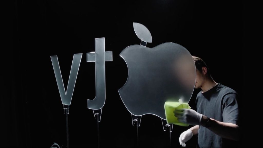
Take two prominent rebrands for example: Apple TV and “We Are XBOX”. When Apple TV dropped the ‘+’, they recreated their logo sequence using practical effects. A physical logo cut out of glass then filmed while manipulating multi-colored lights to create a prismatic effect. The XBOX rebrand achieved something similar, albeit digitally, by reverting their brand to their 2000s logo featuring the iconic XBOX “x” and green glow.
Ok and…
So what does all this mean? As the world is thrust into a hyper-digital age, people are craving one thing: authenticity. All of these styles lean into the human experience. As AI-generated layouts and ads create a sea of sameness, the mixed media of maximalism to the texture found in craftsmanship create a human signal.
None of these aesthetics follow a set of instructions, making them difficult to prompt. They’re built on sourcing colors, typography, layouts and combining them in a tasteful, yet unexpected way. Consumers value authenticity and the advertising world is starting to realize that a design’s effectiveness resides not in its repeatability, but in human ingenuity.